

There are always latest trends in website design to consider; the only thing to take care with is that you don’t get caught up in unimportant changes to your website that cost a lot and don’t return much.
While you don’t want your website design to be old-fashioned, sometimes it does give a website business a look of stability that can be good for business.
For instance, if your website was to advertise your presence as a lawyer, you would not want it to have a trendy, insouciant look, but rather something that appeared really solid and trustworthy, as your clientele would be looking for that kind of thing.
So it’s important to only choose the latest trends that are appropriate.
Since 84% of people use their mobile phones to go on the Internet, you’d want to be sure your website was responsive – suitable for viewing on such a small screen.
This can be a good thing, because it makes you think seriously about how to get your message across in the fewest words – always a good thing. If you waffle on about unimportant matters your visitors will soon click off your website.In a similar way, predictions that video would become king on websites is quickly becoming true. People love watching moving pictures because movement catches the eye as well as the interest. The challenge is to make your video relevant and appropriate to your website business. If it’s not, you risk confusing your visitors and the search engines alike and that would never do.
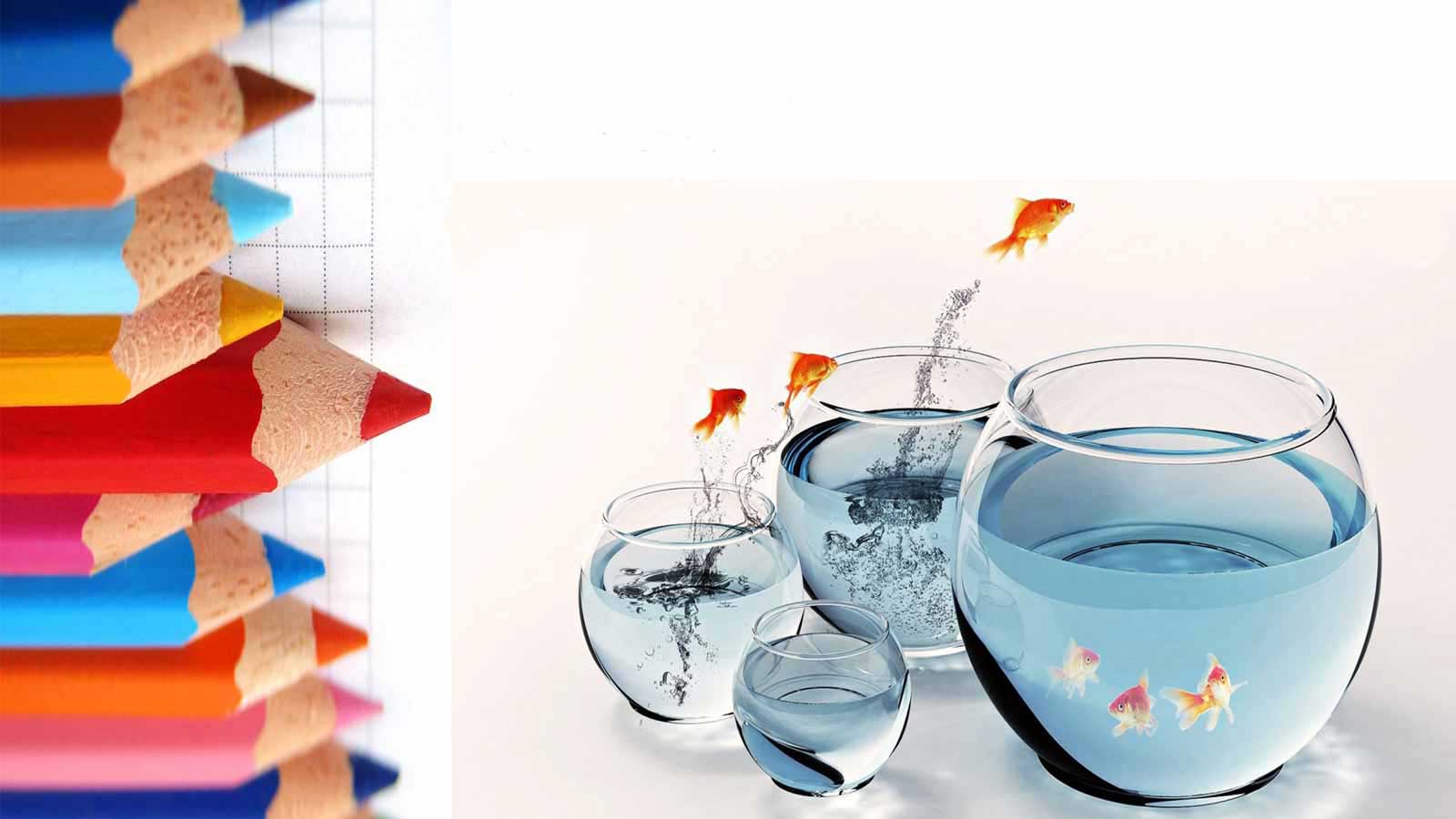
Another change that is starting to be welcomed is the change in colour palettes from safer – and boring – colours to those that are bright, bold and beautiful. So many websites seem to stick with shades of grey and white even in their graphics that is so boring and often makes the text quite difficult to read, it will be a great change to see some bolder colours in use.
Thin white text on shades of light and dark grey is really difficult to read. Just brightening the text would make it easier; making it darker simply blends it in with some of the dark background behind it.
Another trend that takes slabs of information and makes it all easier to read is the use of cards – think Pinterest. Using the same principle to separate and design information on your website makes reading it much easier, especially on mobile phones. Just as bullet points help to make text easier to assimilate quickly, cards could be dubbed the new bullet points. But because they are cards it’s much easier to use visuals such as clip art in them. This makes them even more attractive to website visitors, encouraging them to stay longer on your website with the potential increasing for them to become customers.